
Tuesday, May 13, 2008

Thursday, March 27, 2008
CaPTuRiNG WHaT We LeaRNeD!!
Zone Focus..
..this is when you find one spot to focus on and just focus on that spot and wait for the action to come to you in that spot.
Shutter Speed..
..it should be really high to get a good action shot or really low if you're panning.
Panning..
..low shutter speed where you move with the subject to catch them and everything around them will be blurred.
Waiting for the Pause..
..in every sport there are times where your subject isn't going to move. you should look for these pauses and be waiting for them.
..this is when you find one spot to focus on and just focus on that spot and wait for the action to come to you in that spot.
Shutter Speed..
..it should be really high to get a good action shot or really low if you're panning.
Panning..
..low shutter speed where you move with the subject to catch them and everything around them will be blurred.
Waiting for the Pause..
..in every sport there are times where your subject isn't going to move. you should look for these pauses and be waiting for them.
Monday, March 24, 2008
GReaT auSTiN aRCHiTeCTuRe!!
1..patterns
2..patterns
3..surroundings
4..surroundings
5..angles and shapes
6..light
7..light
8..angles and shapes
9..light
10..surroundings
11..surroundings
12..patterns
13..light
14..angles and shapes
15..angles and shapes
16..angles and shapes**
**favorite photo: I like the angle at which this photo was taken and the way it frames the building. The lighting really adds to the photo because it draws you towards the sky and the building. This picture is symmetrical and very well balanced. It's in good focus and it also has really good leading lines.
2..patterns
3..surroundings
4..surroundings
5..angles and shapes
6..light
7..light
8..angles and shapes
9..light
10..surroundings
11..surroundings
12..patterns
13..light
14..angles and shapes
15..angles and shapes
16..angles and shapes**
**favorite photo: I like the angle at which this photo was taken and the way it frames the building. The lighting really adds to the photo because it draws you towards the sky and the building. This picture is symmetrical and very well balanced. It's in good focus and it also has really good leading lines.
Thursday, March 20, 2008
FoCuS oN a SPoRT!!
I want to shoot the varsity baseball team, on March 25th.
Safety Shots:
Safety Shots:
- players in the dugout.
- fans in the stands.
- the walkthrough at the end.
Money Shots:
- Hitter hitting the ball.
- Outfielder catching a ball.
- Pitcher throwing the ball.
- Runner sliding to base.
Wednesday, January 30, 2008
BeST CoVeRS!!
1: rolling stone: informal
2: vanity fair: formal
3: esquire: informal
5: esquire: environmental
9: harper's bazaar: formal
10: national geographic: informal
11: life: environmental
13: life: environmental
15: harper's bazaar: formal
18: espn: environmental
19: esquire: formal
20: blue: environmental
21: life: environmental
22: george: informal
24: interview: informal
26: people: informal
27: entertainement weekly: environmental
28: life: environmental
29: playboy: formal
29: fortune: environmental
31: newsweek: formal
32: vogue: informal
35: new york: environmental
36: people: formal
37: details: formal
37: glamour: formal
37: time: formal
2: vanity fair: formal
3: esquire: informal
5: esquire: environmental
9: harper's bazaar: formal
10: national geographic: informal
11: life: environmental
13: life: environmental
15: harper's bazaar: formal
18: espn: environmental
19: esquire: formal
20: blue: environmental
21: life: environmental
22: george: informal
24: interview: informal
26: people: informal
27: entertainement weekly: environmental
28: life: environmental
29: playboy: formal
29: fortune: environmental
31: newsweek: formal
32: vogue: informal
35: new york: environmental
36: people: formal
37: details: formal
37: glamour: formal
37: time: formal
Monday, January 28, 2008
CoVeR TYPeS!!
1. Early Magazine Covers:
when magazines first started out most of them didn't really have covers, it was more like a table of contents. Eventually they had covers, but they were like book covers, plain and simple. The pictures on the cover were more for decoration as opposed to actually letting you know what's being talked about in the magazine.
2. The Poster Cover:
When magazines started using poster covers, like early magazine covers, they really had nothing to do with the stories in the magazine. Instead, they were used basically to just make the magazine look nice and/or to convey a certain season or mood. There are also hardly ever any cover lines or themes announced on the front of these magazines, but if there are any they are most of the time very small. Most poster covers looked like "they were printed to be framed and hung on the wall."
3. Pictures Married to Type:
On the magazine covers, pictures are married to type when the words and the picture are in "a symbiotic, mutually supportive relationship." Most of the time with this new design, words were in color and sometimes rather large depending on the style of the magazine. Basically, this is the cover where the words and the picture blend with each other and compliment one another as opposed to taking away from one or the other.
4. In the Forest of Words:
During experimenting with text colors and sizes in the pictures married to type phase, magazine designers became to interested in the words, and not so much the picture. In the forest of words, its exactly that, a forest of words. There are so many words, its easy to get lost. Most of the time in these magazines the words overpower the picture, despite how powerful it may be, and really take away from it.
when magazines first started out most of them didn't really have covers, it was more like a table of contents. Eventually they had covers, but they were like book covers, plain and simple. The pictures on the cover were more for decoration as opposed to actually letting you know what's being talked about in the magazine.
2. The Poster Cover:
When magazines started using poster covers, like early magazine covers, they really had nothing to do with the stories in the magazine. Instead, they were used basically to just make the magazine look nice and/or to convey a certain season or mood. There are also hardly ever any cover lines or themes announced on the front of these magazines, but if there are any they are most of the time very small. Most poster covers looked like "they were printed to be framed and hung on the wall."
3. Pictures Married to Type:
On the magazine covers, pictures are married to type when the words and the picture are in "a symbiotic, mutually supportive relationship." Most of the time with this new design, words were in color and sometimes rather large depending on the style of the magazine. Basically, this is the cover where the words and the picture blend with each other and compliment one another as opposed to taking away from one or the other.
4. In the Forest of Words:
During experimenting with text colors and sizes in the pictures married to type phase, magazine designers became to interested in the words, and not so much the picture. In the forest of words, its exactly that, a forest of words. There are so many words, its easy to get lost. Most of the time in these magazines the words overpower the picture, despite how powerful it may be, and really take away from it.
PoRTRaiT iDeaS!!
 I like this portrait because it just seems so real. When I look at it, I don't get the feeling that it was posed. The way he's curled up in a fetal position makes it seem like he cant function without her, it makes him look so innocent and helpless, like he needs her to survive. She's his lifeline. I want to capture this realness in my photos. I want my photos to mean something like this one does.
CoLoR SHooT!!
I plan on shooting photos of my sister at my house. I need to do it this week and I will need the camera. I don't know how long I'll need the camera, it might be more than one day.
Thursday, December 6, 2007
I think a photojournalists ethics should be situational because not everyone's always right and you can rely on someone to tell you what's ethical and what's not, but who's to say that that person is always right? nobody. so i think that it should be situational and the person who shot the photo should have the right to do what they think is ethical or unethical because something like that is always just going to be your opinion.
I believe that a photo can really capture the truth, but its up to you to actually show the truth in your photos.
I believe that a photo can really capture the truth, but its up to you to actually show the truth in your photos.
Tuesday, December 4, 2007
PHoTo MaNiPuLaTioN!!
While searching for a picture to put on the cover of their new student applications, UW-Madison came across one they seemed to really like. There was just the small fact that the picture did not have any minorities in it, and didnt give the thought or idea that they were trying to get across. The picture was all whites and they wanted some diversity on their cover seeing as how minorities were more than 9% of their students. They decided to crop the picture and insert a black students face in the picture. The applications were made and sent out. When it was found out what they had done, they were very embarassed and agreed that what they had done was unethical and wrong. They said that the photo was only manipulated because they has such a short notice and not much time to get the photo published. However, it has been promised that another application will be sent out with a different, unedited picture shortly.
I think that what they did was wrong. The fact that they only did it so that it would look like their school had minorities involoved only made it worse. They should have just left the photo alone, it was fine like it was, because any normal person isn't going to look at that photo and be like...oh my gosh there's no minorities in this photo...unless it was pointed out by someone. But I personally don't think people do that.
I think that what they did was wrong. The fact that they only did it so that it would look like their school had minorities involoved only made it worse. They should have just left the photo alone, it was fine like it was, because any normal person isn't going to look at that photo and be like...oh my gosh there's no minorities in this photo...unless it was pointed out by someone. But I personally don't think people do that.
Thursday, November 15, 2007
FuNNY CaPTioNS!!
 The city of Austin has been ordered to release
 all monkeys from work because of disruptions
in society and confusion on the streets. Although it has been said that they have the same intelligence as humans, they will no longer be allowed to work along side us in the work force because of one's latest mistake. "sotp" has caused many complications in our society and has resulted
in sad consequences.
Oscar the cat suits up in his
army gear as he prepares to
battle fluffy the miniature poodle.
This fight resulted after a verbal
confrontation that took place in the
park earlier that week.

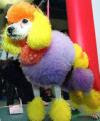 After throwing a hissy fit
 Ms. Piggy states that she
will never go to Susie's
Sassy Hair Salon ever again after what they have
done to her gorgeous pink
hair. She pressed charges
later that day for the
damage they did and the
emotional trauma they
caused.
Thursday, November 8, 2007
9/11 CoMPoSiTioN!!
 BALANCE
The horses facing opposite directions and overlapping in the middle makes them even on both sides. This allows the photo to be very well balanced.
 AVOIDING MERGERS
This pictures shows mergers in the boy and the man. They're legs and feet are both cut out of the picture. Also the head of the lady in the righ corner is a little cut off.
 RULE OF THIRDS
The offset of the still standing building to the right corner demonstrates thirds. It really compliments the photo as opposed to just being in the middle.
 SIMPLICITY
The plain sky and the bland color of the clouds behind the flag really bring out the color in the flag and makes all the focus mainly on the flag. This is a simple photo because of the background that really pushes out the flag and the people holding it.
 LINES
LINESI think that this photo really forces you to look at the person sitting in the middle of this empty room. The lines of the pews and just the dull color of them really make the bandana on the person stand out leading you to them.
 FRAMING
In this picture the dark broken walls of the building frame the smoke filled room and really pull your eye towards the center object of the picture which is the whole room basically falling apart.
Thursday, November 1, 2007
aFTeR PRiNTiNG PoST!!
Before I made my picture, I had to clean my negatives because they had water spots. I dipped them in a photo cleaner solution and then used special photo wipes to clean the spots off.
The negatives were loaded into the enlarger on a little thing kind of like a slide and you could see the picture on the bottom.
On the side of the enlarger there is a round focuser that focuses the image. You turn it until you think its focused right. When you think it's right you have to use this magnifying glass and place it directly under the light so that it reflects into it to make sure it's perfect. You want to see little grains.
I put a strip of photo paper under the enlarger and set the timer for the lighting at different times so when I was done I had different exposures on my test strip.
I picked the exposure I thought was best and then did everything over again but on the full photo sheet and made my final picture. I ran it through the chemicals for the required times and then let it dry.
The negatives were loaded into the enlarger on a little thing kind of like a slide and you could see the picture on the bottom.
On the side of the enlarger there is a round focuser that focuses the image. You turn it until you think its focused right. When you think it's right you have to use this magnifying glass and place it directly under the light so that it reflects into it to make sure it's perfect. You want to see little grains.
I put a strip of photo paper under the enlarger and set the timer for the lighting at different times so when I was done I had different exposures on my test strip.
I picked the exposure I thought was best and then did everything over again but on the full photo sheet and made my final picture. I ran it through the chemicals for the required times and then let it dry.
Tuesday, October 16, 2007


Tuesday, October 2, 2007
NeGaTiVeS CRiTiQue!!
The only problem I had with my negatives was that there
were a few water spots but nothing big or major was wrong with them.
My best photo, I think, was #10. It had great focus and the lighting was good.
I also liked #7, it really filled the frame and also had pretty good focus.
aCaDeMiCS #1!!
 Filling The Frame:
The frame on this picture is filled, i think, rather perfectly.
Everywhere you look something is happening,
but it's not too much either.
I think this is a really good image and it's not too little or too much.
 Action And Emotion:
This picture shows both action and emotion.
The photo was taken in the middle of a pass and
so the ball is in mid-air and the boy is going in for the catch.
The look on the boys face is the emotion
because he has this look on his face
like he doesn't know if he's going to catch the ball or not.
This picture is very suspensful.
 The Story:
I think this picture is a story about this girl who is kind of in
her own little world. There's all this blur around her
because so much is going on and there's so much movement,
but she never even notices.
It could also be that maybe the girl feels left out or alone in all the chaos.
It could also be that maybe the girl feels left out or alone in all the chaos.
CoNTeST PReVieW!!
 ATPI Fall Contest 2002 Winners
I think this photo is powerful because of all the emotion
and innocence it captures.
the lighting and the shadows really bring out the little girls face.
Its just a really good picture.
Wednesday, September 19, 2007
PiNHoLeS!!

this picture is confusing.
i dont know if there are any people in here or whats going on.
the whole thing seems way out of focus.

i like this pinhole photo, i think its really nice.
there are no people or action in this photo.
i think the river and the ground are sharp and the trees are soft.
Friday, August 31, 2007
PHoTo CRiTiQue!!
 This picture doesn't fill the frame well at all.
I don't think the focus is all that great either.
It is an action shot though.
 I think this picture fills the frame really well.
It was an action shot and the focus is good.
Subscribe to:
Posts (Atom)