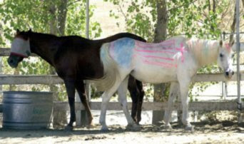
The horses facing opposite directions and overlapping in the middle makes them even on both sides. This allows the photo to be very well balanced.
This pictures shows mergers in the boy and the man. They're legs and feet are both cut out of the picture. Also the head of the lady in the righ corner is a little cut off.
The offset of the still standing building to the right corner demonstrates thirds. It really compliments the photo as opposed to just being in the middle.
The plain sky and the bland color of the clouds behind the flag really bring out the color in the flag and makes all the focus mainly on the flag. This is a simple photo because of the background that really pushes out the flag and the people holding it.
I think that this photo really forces you to look at the person sitting in the middle of this empty room. The lines of the pews and just the dull color of them really make the bandana on the person stand out leading you to them.


No comments:
Post a Comment