I think a photojournalists ethics should be situational because not everyone's always right and you can rely on someone to tell you what's ethical and what's not, but who's to say that that person is always right? nobody. so i think that it should be situational and the person who shot the photo should have the right to do what they think is ethical or unethical because something like that is always just going to be your opinion.
I believe that a photo can really capture the truth, but its up to you to actually show the truth in your photos.
Thursday, December 6, 2007
Tuesday, December 4, 2007
PHoTo MaNiPuLaTioN!!
While searching for a picture to put on the cover of their new student applications, UW-Madison came across one they seemed to really like. There was just the small fact that the picture did not have any minorities in it, and didnt give the thought or idea that they were trying to get across. The picture was all whites and they wanted some diversity on their cover seeing as how minorities were more than 9% of their students. They decided to crop the picture and insert a black students face in the picture. The applications were made and sent out. When it was found out what they had done, they were very embarassed and agreed that what they had done was unethical and wrong. They said that the photo was only manipulated because they has such a short notice and not much time to get the photo published. However, it has been promised that another application will be sent out with a different, unedited picture shortly.
I think that what they did was wrong. The fact that they only did it so that it would look like their school had minorities involoved only made it worse. They should have just left the photo alone, it was fine like it was, because any normal person isn't going to look at that photo and be like...oh my gosh there's no minorities in this photo...unless it was pointed out by someone. But I personally don't think people do that.
I think that what they did was wrong. The fact that they only did it so that it would look like their school had minorities involoved only made it worse. They should have just left the photo alone, it was fine like it was, because any normal person isn't going to look at that photo and be like...oh my gosh there's no minorities in this photo...unless it was pointed out by someone. But I personally don't think people do that.
Thursday, November 15, 2007
FuNNY CaPTioNS!!
all monkeys from work because of disruptions
in society and confusion on the streets. Although it has been said that they have the same intelligence as humans, they will no longer be allowed to work along side us in the work force because of one's latest mistake. "sotp" has caused many complications in our society and has resulted
in sad consequences.
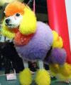
Oscar the cat suits up in his
army gear as he prepares to
battle fluffy the miniature poodle.
This fight resulted after a verbal
confrontation that took place in the
 After throwing a hissy fit
 Ms. Piggy states that she
will never go to Susie's
Sassy Hair Salon ever again after what they have
done to her gorgeous pink
hair. She pressed charges
later that day for the
damage they did and the
emotional trauma they
caused.
Thursday, November 8, 2007
9/11 CoMPoSiTioN!!
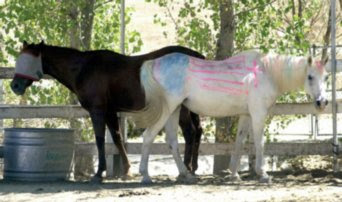
The horses facing opposite directions and overlapping in the middle makes them even on both sides. This allows the photo to be very well balanced.
This pictures shows mergers in the boy and the man. They're legs and feet are both cut out of the picture. Also the head of the lady in the righ corner is a little cut off.
The offset of the still standing building to the right corner demonstrates thirds. It really compliments the photo as opposed to just being in the middle.
The plain sky and the bland color of the clouds behind the flag really bring out the color in the flag and makes all the focus mainly on the flag. This is a simple photo because of the background that really pushes out the flag and the people holding it.
I think that this photo really forces you to look at the person sitting in the middle of this empty room. The lines of the pews and just the dull color of them really make the bandana on the person stand out leading you to them.
Thursday, November 1, 2007
aFTeR PRiNTiNG PoST!!
Before I made my picture, I had to clean my negatives because they had water spots. I dipped them in a photo cleaner solution and then used special photo wipes to clean the spots off.
The negatives were loaded into the enlarger on a little thing kind of like a slide and you could see the picture on the bottom.
On the side of the enlarger there is a round focuser that focuses the image. You turn it until you think its focused right. When you think it's right you have to use this magnifying glass and place it directly under the light so that it reflects into it to make sure it's perfect. You want to see little grains.
I put a strip of photo paper under the enlarger and set the timer for the lighting at different times so when I was done I had different exposures on my test strip.
I picked the exposure I thought was best and then did everything over again but on the full photo sheet and made my final picture. I ran it through the chemicals for the required times and then let it dry.
Tuesday, October 16, 2007
Tuesday, October 2, 2007
NeGaTiVeS CRiTiQue!!
The only problem I had with my negatives was that there
were a few water spots but nothing big or major was wrong with them.
My best photo, I think, was #10. It had great focus and the lighting was good.
I also liked #7, it really filled the frame and also had pretty good focus.
aCaDeMiCS #1!!
The frame on this picture is filled, i think, rather perfectly.
Everywhere you look something is happening,
but it's not too much either.
I think this is a really good image and it's not too little or too much.
This picture shows both action and emotion.
The photo was taken in the middle of a pass and
so the ball is in mid-air and the boy is going in for the catch.
The look on the boys face is the emotion
because he has this look on his face
like he doesn't know if he's going to catch the ball or not.
This picture is very suspensful.
I think this picture is a story about this girl who is kind of in
her own little world. There's all this blur around her
because so much is going on and there's so much movement,
but she never even notices.
It could also be that maybe the girl feels left out or alone in all the chaos.
It could also be that maybe the girl feels left out or alone in all the chaos.
CoNTeST PReVieW!!
Wednesday, September 19, 2007
PiNHoLeS!!
Friday, August 31, 2007
PHoTo CRiTiQue!!
I don't think the focus is all that great either.
It is an action shot though.
It was an action shot and the focus is good.
Subscribe to:
Comments (Atom)


